Finance Growth
How to Design a Premium Tap-to-Pay Experience That Users Love
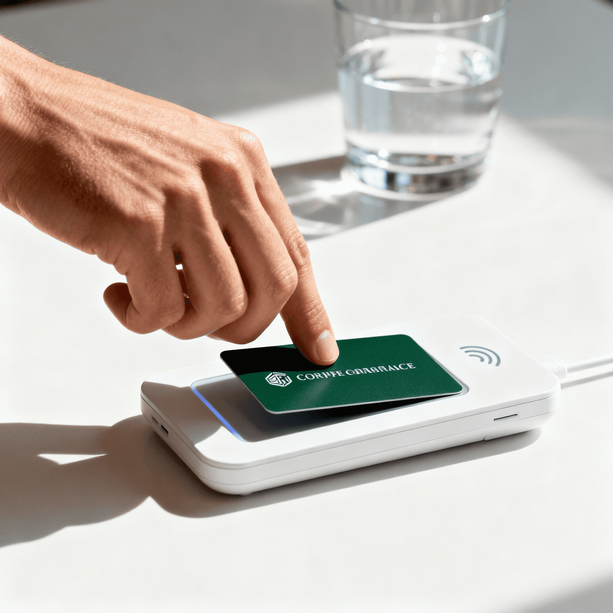
The Invisible Art of Tap-to-Pay
Every time a customer taps their card or phone at a terminal, there is a brief moment that shapes their perception of an entire brand. It lasts barely a second, yet the design decisions behind that interaction determine whether a fintech product feels trustworthy, premium, or forgettable. In a world where digital payments have become the default, the checkout experience has evolved from a simple transaction into a brand statement.
For fintech companies, the tap-to-pay moment is no longer just about moving money. It is about delivering confidence, speed, and a subtle sense of delight that keeps users coming back.
Why the Payment Moment Matters More Than Ever
Consumer expectations around digital payments have shifted dramatically. According to recent industry data, contactless transactions now account for over 60 percent of all in-person payments globally. With that volume, every micro-interaction carries enormous weight.
Consider the feedback loop when a payment succeeds: a gentle vibration, a green checkmark, a soft chime. These elements are not accidental. They are carefully orchestrated to reinforce trust and reduce anxiety. When done poorly — a delayed response, an ambiguous loading spinner, or a jarring error screen — the user's confidence erodes instantly.
The best fintech brands understand that this moment is a design opportunity, not a technical afterthought.
Designing for Speed Without Sacrificing Clarity
One of the greatest challenges in payment UX is balancing speed with comprehension. Users want transactions to feel instant, but they also need to understand what just happened. Did the payment go through? Was the right amount charged? Is there a receipt?
Leading fintech apps address this with layered feedback. The primary confirmation — a checkmark or success animation — appears within 300 milliseconds. Secondary details like the merchant name, amount, and category tag follow in a subtle expansion. This approach satisfies the need for instant gratification while providing the transparency that builds long-term trust.
Haptic Feedback and Sound as Design Tools
Visual design alone is not enough for a premium payment experience. Haptic feedback — the subtle vibrations delivered through a smartphone — plays a critical role in confirming that a tap was registered. Apple Pay's distinctive double-pulse vibration has become so recognizable that users associate it with payment success before they even glance at the screen.
Sound design follows a similar principle. A payment confirmation tone should be brief, pleasant, and distinct from notification sounds. The goal is to create an audio signature that users learn to trust instinctively, reducing the cognitive load of verifying each transaction visually.
The Role of Animation in Building Confidence
Motion design transforms a static success screen into an experience. A well-crafted animation — like a card icon smoothly transitioning into a checkmark — tells a visual story of completion. It communicates that something meaningful happened, even if the technical process was invisible.
However, animation must be restrained. Overly elaborate transitions slow down the experience and can feel performative rather than functional. The best payment animations are under 400 milliseconds, use easing curves that feel natural, and reinforce the primary message without competing for attention.
Error States Deserve Equal Attention
Most fintech teams invest heavily in the success path but neglect the failure experience. When a payment declines, the design must communicate what happened, why, and what the user should do next — all without creating panic or embarrassment.
Effective error states use calm, neutral language instead of alarming red screens. A message like "This payment didn't go through — try another card or contact your bank" is far more helpful than a generic "Transaction Failed" alert. Providing a clear next step keeps the user in control and reduces frustration.
Building a Premium Checkout Identity
For fintech brands aiming to differentiate in a crowded market, the tap-to-pay moment is an underutilized canvas. Custom animations, branded color palettes during confirmation, and personalized receipt screens all contribute to a cohesive identity that extends beyond the app itself.
The companies that treat payment design as a first-class product discipline — not just an engineering integration — are the ones earning the strongest user loyalty. In fintech, trust is the ultimate currency, and it is built one tap at a time.